Quick reference
This page shows examples of how to apply the UX Map visual language to map out the content and interactions of your digital products. The UX Map syntax is not rigid and you can adapt it to your specific goals. You can also check the sample project on AxShare to see a concrete example, applied to a hypothetical website prototype.
Content/Widget
Any content, widget, portion of the UI that is convenient to represent as a standalone entity. It could sometimes be a web page or a mobile screen (as in a conventional sitemap), or you might want to break these down into components, each represented by a separate block. There's no rigid definition, just use to your convenience.


Content / Widget (link)
As above, but to be used when you want the widget to work as a link to a specified target on the UX Map (or anywhere in the prototype). In example b) below, taken from the demo file, the content of the inlay error message is available on another page in the prototype.


Widget wrapper
Use this to embed several UX map widgets together, whenever you need to break down a portion of the UI into the individual components, but you still want to group them together as a whole. You can use a wrapper to identify a page, a portion of a page, a navigation menu, and more.


Section wrapper
Use it to identify a group of widgets, contents or interactions that can be semantically grouped together as a whole.

Section header / Vertical header
These widgets can help you group portions of the UX Map together, similarly to the section header, but at a higher level (or whatever is your preference).


Background event
A component of the interaction whose effect is not immediately visible to the user, i.e. an email sent, a database update, a value or content saved temporarily in the browser cache. It can also be used in a more abstract way, to define a process that takes place behind the scenes.


Condition
Use it whenever two different outcomes are possible, and they can be expressed as a "yes/no" condition. Conditions can be use to describe a real computational process, or in a more abstract manner, as a point in the flow where conditional logic is a convenient and practical way to differentiate between states/events (e.g. "User is logged in").

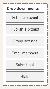
Conditional list
A condition with multiple outcomes. The most common examples are dropdown menus or navigation menus, but similarly to the "yes/no" condition, it can also be used in a more abstract way.

Action or event
An interaction or process that produces an outcome, and is conveniently identified as a standalone entity. It can be a simple user action (such as "User logs in"), or a more complex sequence of events/actions that can be identified as a trigger or condition for the interactions that follow.


Process / External
A sequence of interactions or processes that is conveniently identified as a standalone entity. Use it when you want to include an interaction flow in a generic manner, without entering into the details, i.e. a checkout process. It can also represent a sequence of interactions that are out of the scope of the UX map (an external site for example), but still has to be included as part of the flow.


Primary / secondary button
Use it to identify buttons or calls to action depending on their importance / visual weight.


Event trigger
Any interaction trigger other than a button or link. Edit the text to describe what the trigger is. You can also use the bespoke event triggers, with icons that help you identify gestures, mouse and keyboard interactions, as well as animations/state changes. Icons alone can be self explanatory enough, but sometimes it's useful to add a description of what the event trigger is.


Multi-step process
Used to indicate a step-by-step process where the user is lead from one step to the other, in a prescribed order.

Annotation
Use this to add contextual notes across the UX Map. You can apply annotations to individual widgets or groups of widgets.

Reference
Use this when you need to add an identifier to a portion of the UX Map. There can be multiple use cases, the most common is to use this widget to identify a user story or scenario that is related to that particular section of the UX Map. You can also add a link to an external URL (a JIRA page containing the user story, for example).
In the demo project, the visibility of references is toggled on and off by clicking on the annotation icon in the main UX Map switch.

WIP
This widget is meant to stand out, and you can use it to identify portions of the UX Map where there's still work in progress, as a reminder. You can also add a description, if that helps.


Go to section (anchor link)
Use the Go to (link) widget to let users navigate to another portion of the UX Map (the target). Details on how to set up the interaction can be found on the reference guide, included in the UX Map package.
A non interactive version is also available, if you want to identify a section that is part of the UX Map, without creating a direct link. If the section that you want to reference to is not part of the UX Map, you may want to use the "Process / External" widget, instead.


Hot spot
This has the same function of the hotspot widget in the default widget library. It is a tool that you can use to add a transparent layer on top of any portion of the UX Map, to add interactions. It can also be used as a target for scrolling interactions.
Snapshot
Same as the snapshot widget in the default widget library.

Horizontal/Vertical line, Curly bracket, Text, Image
Native widgets belonging to the default widget library, these graphic elements can be handy when building a map of the user experience.
Main navigator
This widget allows to set global anchor links so the viewers of the UX Map to navigate from one portion of the map to the other. Add targets and then associate a "scroll to" interaction to them where the target is the portion of the UX Map that you want to navigate to. See the reference guide in the downloaded package for more details.
